
How does Departure Design improve the in-store shopping experience?
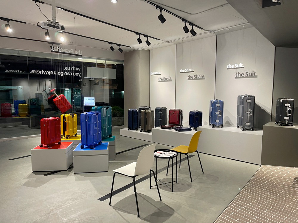
Compared with regular travel retail, Departure focuses on the “traveler experience”, Departure Thong Lo is a store dedicated to customers who have a chance to experience and interact with products deeply.
First of all, I defined the project scope and design concept to clearly define the goals in order to create a UX-oriented store with a welcoming atmosphere and a cohesive brand identity.
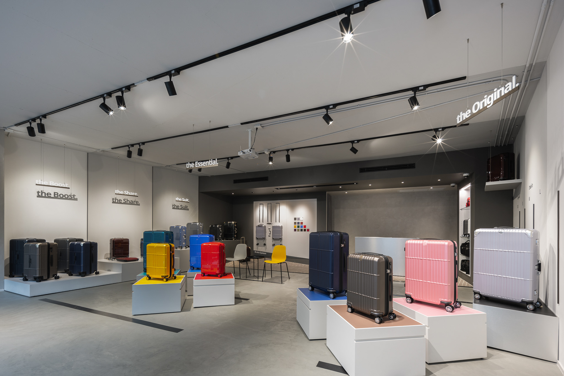
By working with a Japanese interior design team, Fast Space Design, we designed Departure’s first UX-oriented store overseas—Departure Thong Lo. There are several key features that the store equipped.
Design Concept: The Dance of Light and Shadow
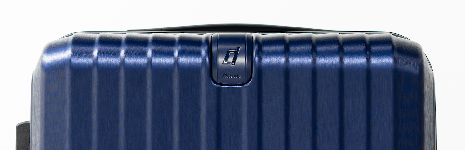
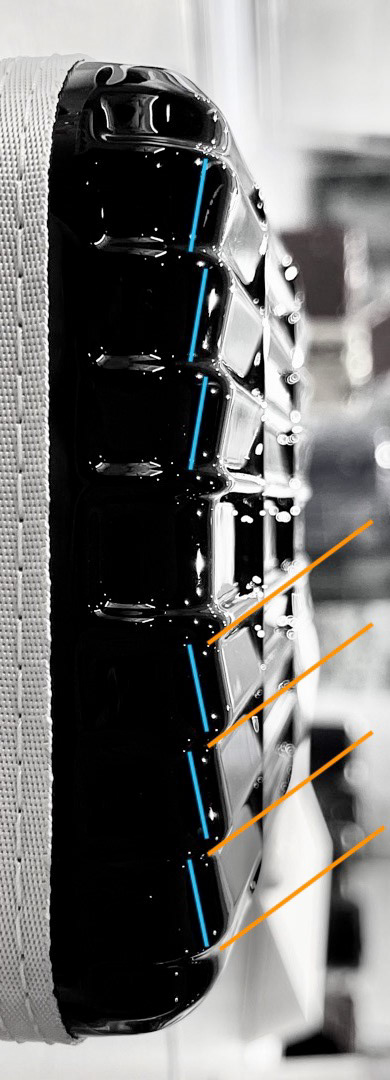
The inspiration for the design came from the classic look of Departure luggage— The Departure Stripe. The Departure Stripe is not just a pattern of simple straight lines, it is designed with a special angle of incidence, which makes the Departure so special and outstanding. Each stripe pattern is fused perfectly and harmonically with each other and the structure of the stripe design itself is brilliantly presented as a whole. Actually, it can be considered a piece of art.
Based on different viewpoints and lighting situations, the Departure Stripe presents various visual representations. The reflection of the light creates constant and beautiful illumination as if the customers immerse in the sparkles from the kaleidoscope. The natural element of the light combines the deliberate stripe design and cleverly utilizes the viewpoint change from the viewers to create a magical feast of light & shadow just like a piece of lovely jewelry.
This inspires me to design the store with light and shadow: Shades, Tones, & Tints
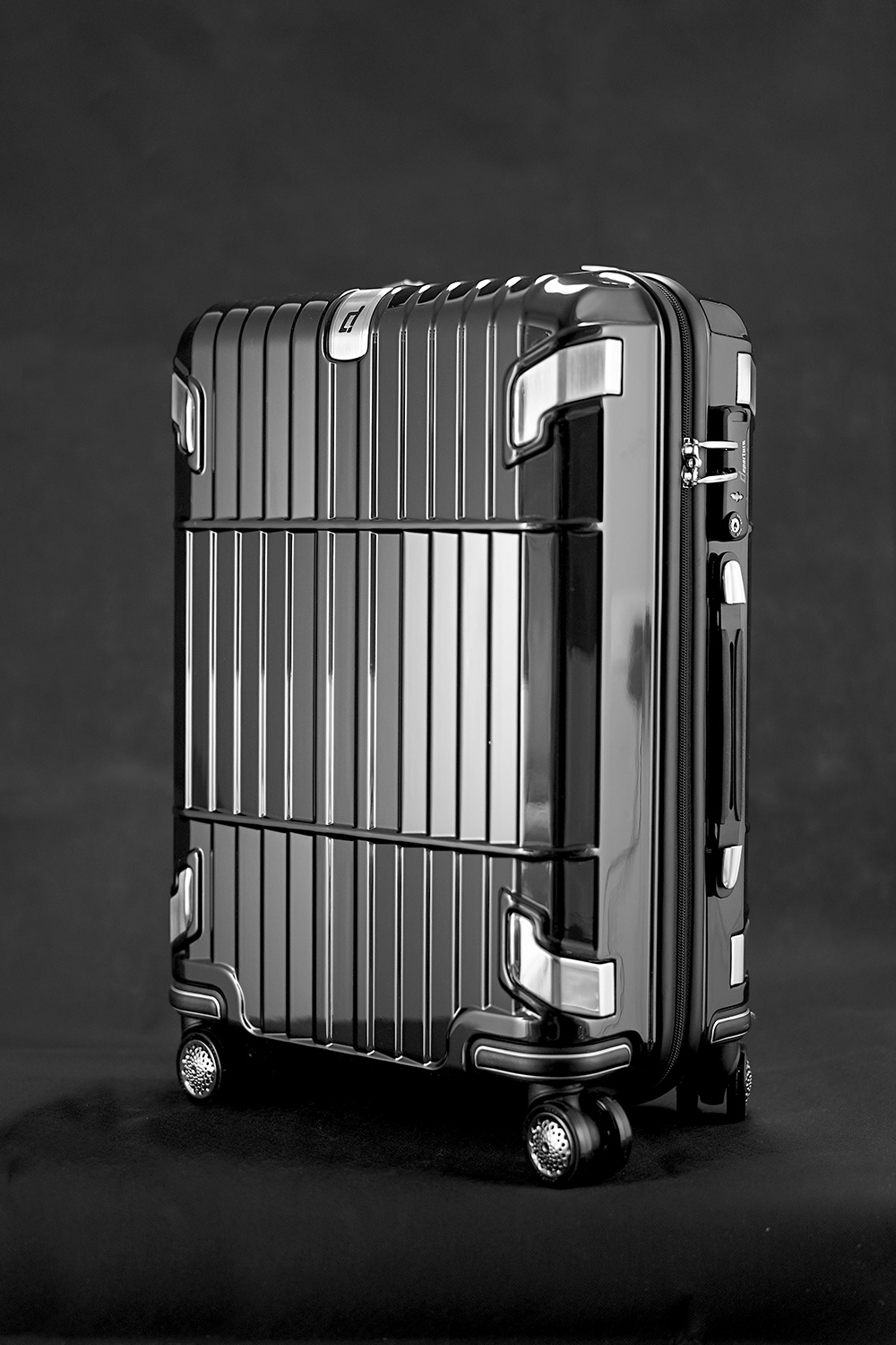
Different light reflecting surface creates the different value of shade. That's why it makes Departure luggage so unique and attractive.
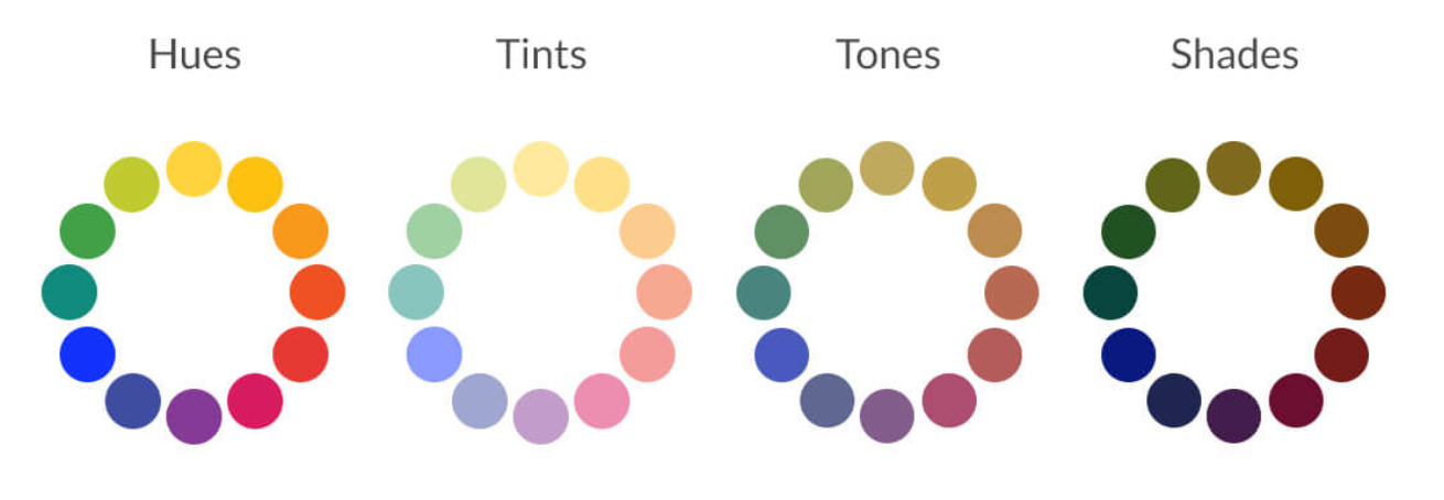
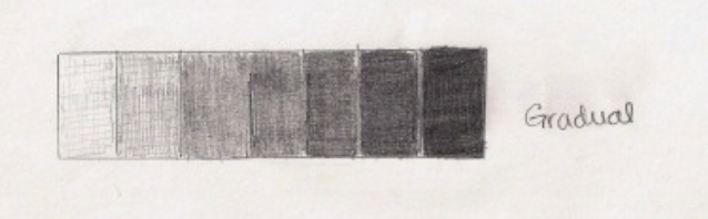
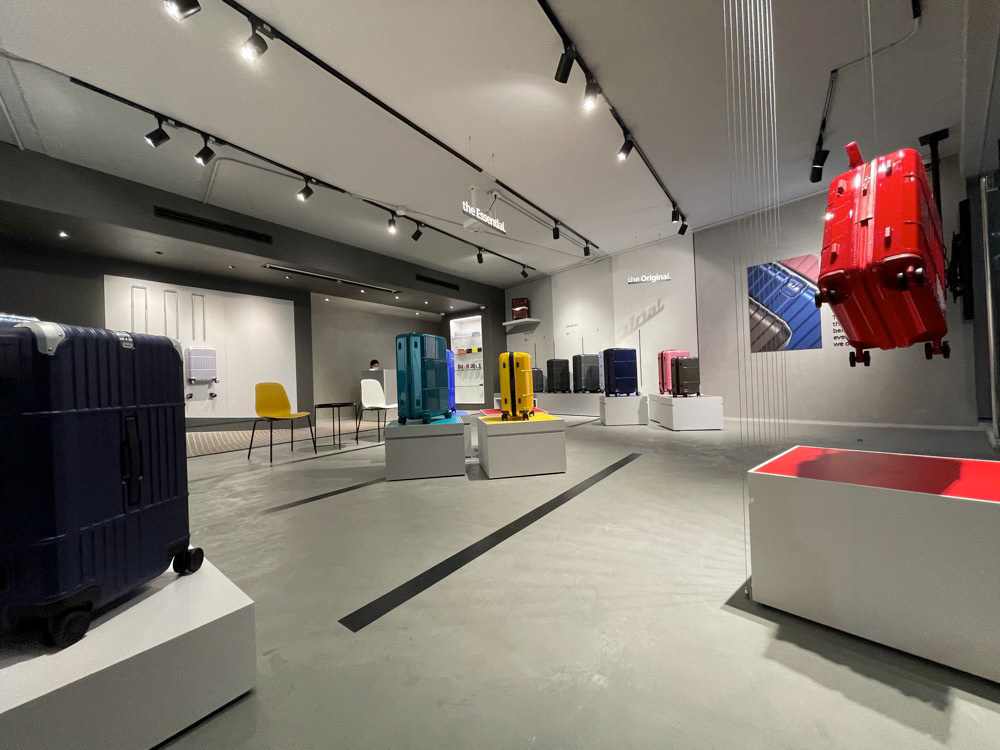
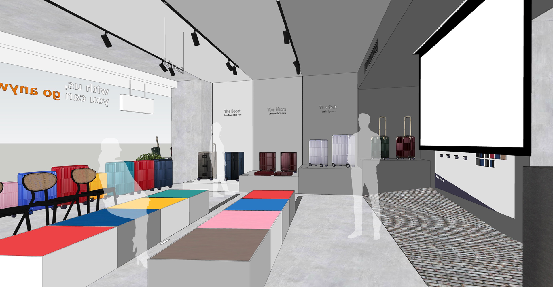
The core design concept of Departure Thong Lo is the appreciation of light and shadow. The change of light and shadow creates dynamic movement. Light, shadow, and movement, these elements are the core design values driving the whole space creation, and every design detail.
The store environment uses a neutral grey tone laying out the store, there are two main reasons:
1. The gradual shades create dynamic movement and visual interest.
2. Departure offers a lot of attractive color variation for customers, it is the best way to stand out products with muted background (context) which helps customers focus on products more.
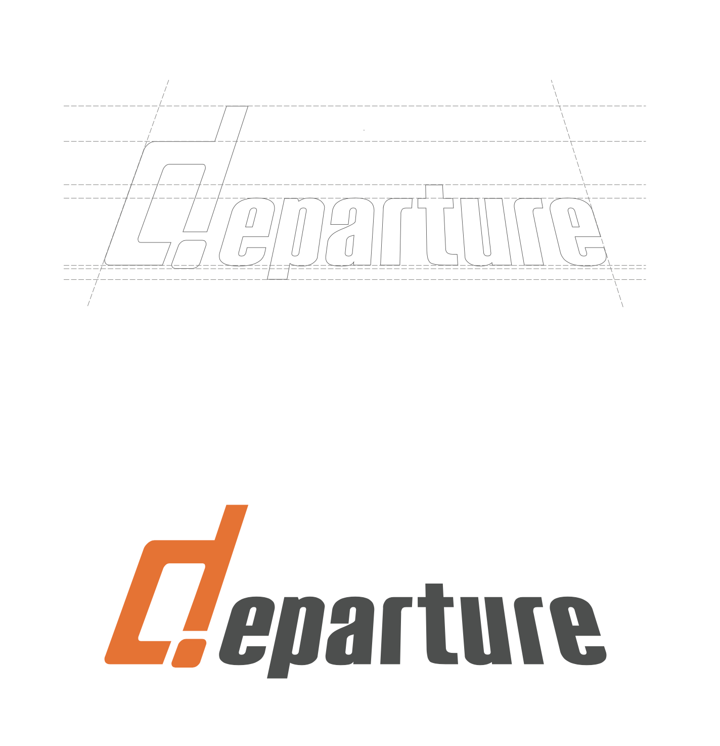
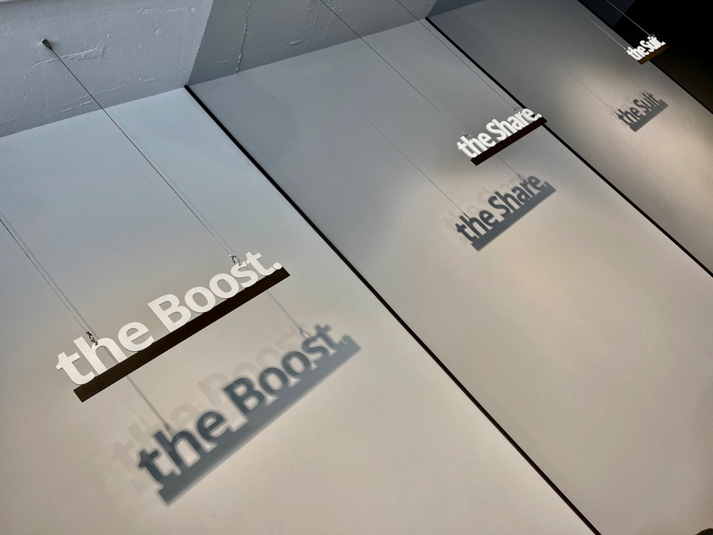
Departure Logo Design
Before talking about the design concept of the store layout, let's take a look at the logo design:
Departure's logo was designed in a single (one-point) perspective conveying imagery of moving forward just like we are on an (airport) runway toward — Departure. Our team wants to communicate our brand, Departure, which is solely dedicated to making you enjoy every moment of your journey. Perspective is a technique to give an image on a flat surface with a feeling of depth. By designing in perspective, the logo/branding creates a sense of depth with dynamic movement — pursuit/chasing. With that idea and the mission we carry, we pursue excellence with passion and commitment in order to have better products and travel experiences for our friends/customers/travelers.
Departure's logo was designed in a single (one-point) perspective conveying imagery of moving forward just like we are on an (airport) runway toward — Departure. Our team wants to communicate our brand, Departure, which is solely dedicated to making you enjoy every moment of your journey. Perspective is a technique to give an image on a flat surface with a feeling of depth. By designing in perspective, the logo/branding creates a sense of depth with dynamic movement — pursuit/chasing. With that idea and the mission we carry, we pursue excellence with passion and commitment in order to have better products and travel experiences for our friends/customers/travelers.
The concept of active, lively, positive movement is very important to Departure both its abstract (pursuit excellence with passion and commitment) and physical (rolling luggage→ go anywhere) representation.
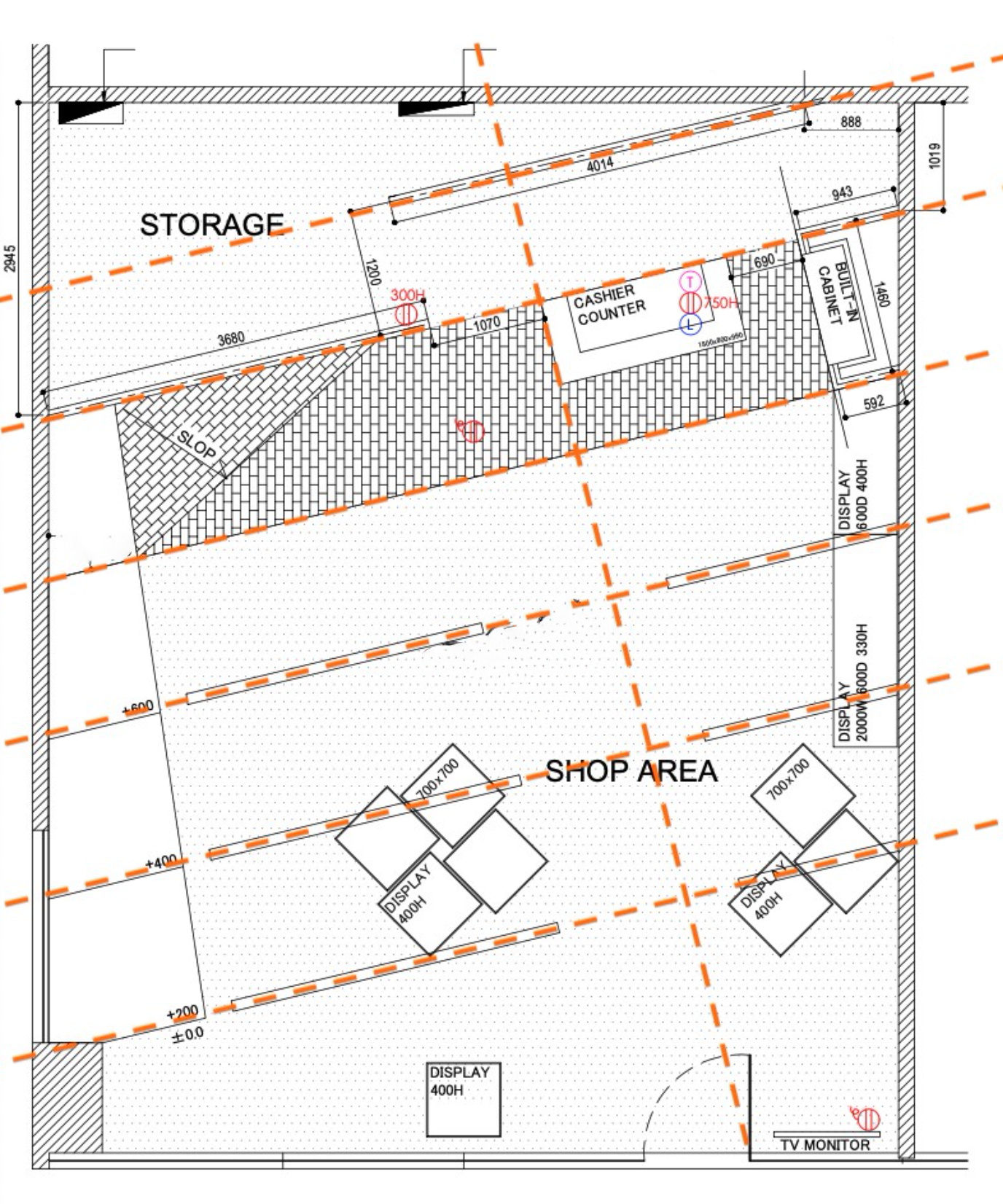
Store Layout: Asymmetrical Floor Plan
We took 3 design principles:
Asymmetry Balance,
Diagonal Composition, and
Gestalt Psychology—the Law of Common Fate,
into deep consideration and came up with the layout.
Asymmetry Balance,
Diagonal Composition, and
Gestalt Psychology—the Law of Common Fate,
into deep consideration and came up with the layout.
In order to achieve this idea, Departure Thong Lor takes an advantage of asymmetry design to create an interesting, active, and lively visual representation. It evokes feelings of modernism, movement, energy, and vitality. Compared with symmetrical forms, asymmetrical forms lack balance but create more complex relationships between design elements. As the result, the asymmetry design tends to be more visually interesting than symmetry and can be used to draw attention.
Diagonal Composition represents a balanced composition of dynamically intersecting and crossing parallel and diagonal lines. Diagonal lines suggest movement and action. Because diagonals are associated in the mind with the motion of the effort to balance/offset resistance they give animation to any composition in which they appear. The store uses floor print and the lighting track rail to reinforce the diagonal composition, and those diagonal lines trigger the principle of Gestalt Psychology, The Law of Common Fate, which identifies the human tendency to perceive visual elements moving in the same direction or in unison as grouped. The store layout creates the feeling of dynamic movement and perfectly resonates with the imagery that Departure is trying to convey— rolling & go anywhere.
——————————————————————————
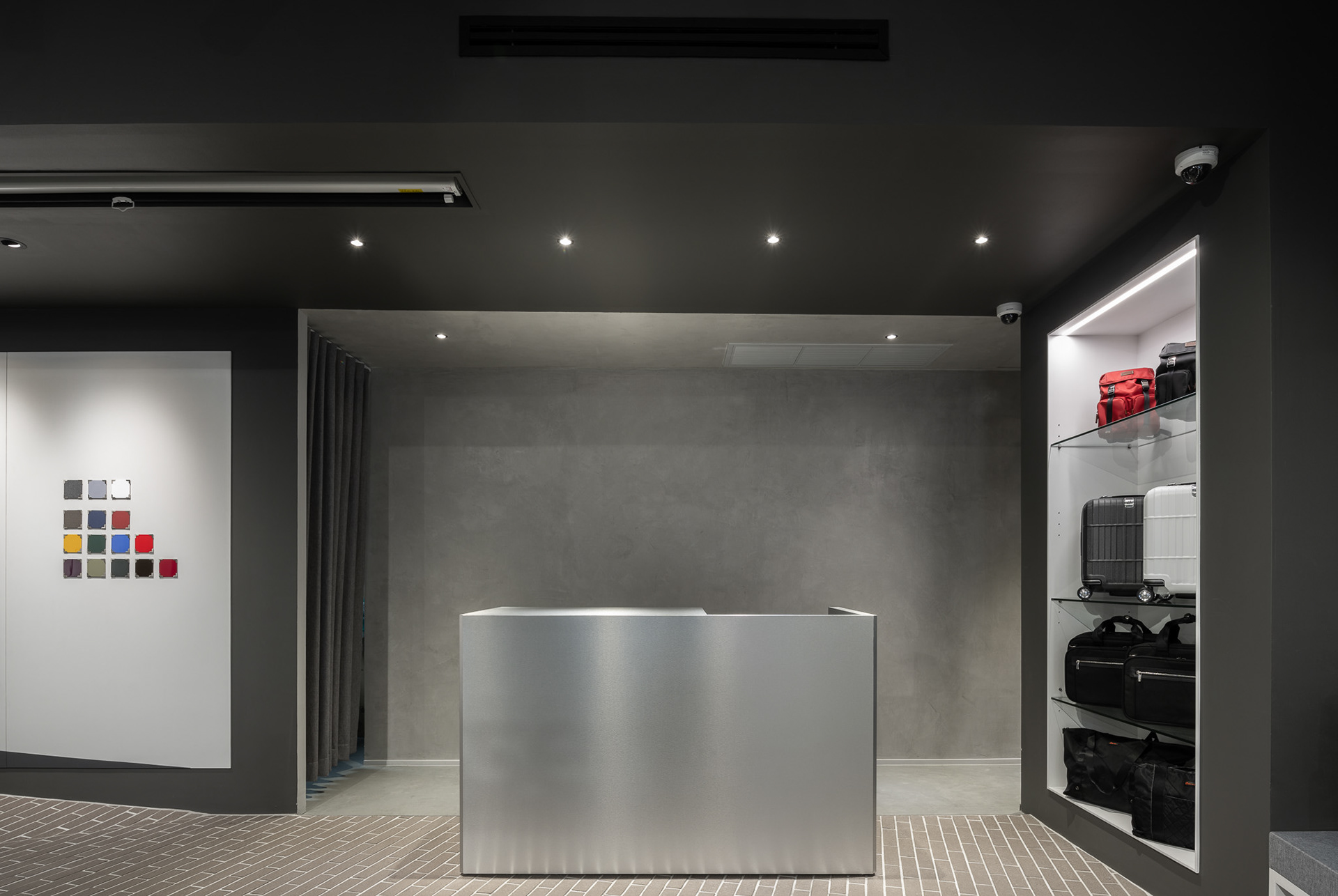
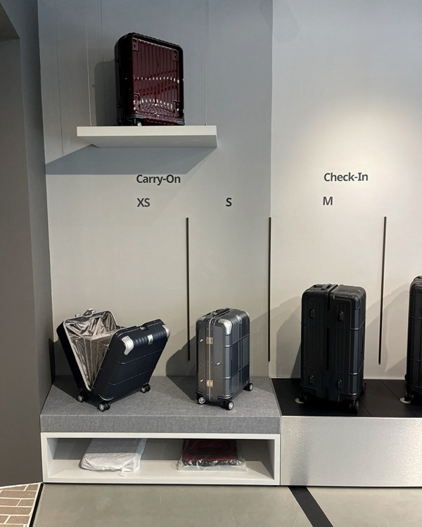
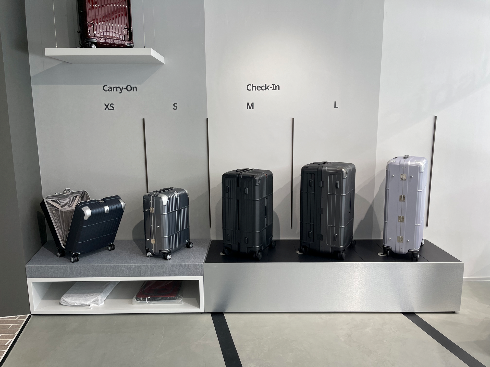
Size Guide Product Display:
Immersive Traveler Experience Design
Immersive Traveler Experience Design
We would like our travelers/customers to understand our size guide at a glance, and here we came up with the design. Because of the dividers and indicators, people can easily realize which are carry-ons, and check-ins.
As we mentioned, Departure focuses on the "traveler experience" in-store shopping experience, there are several design tricks we would like to share with you. We try to convey the airport feeling to customers, and the size guide area combined some scenes you may face in the airport.
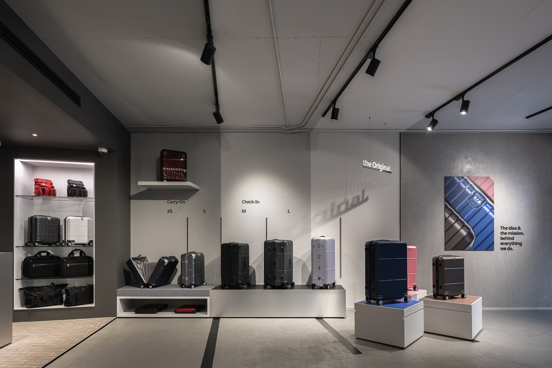
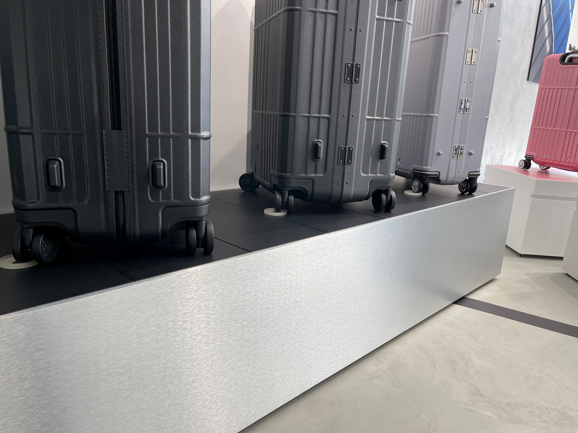
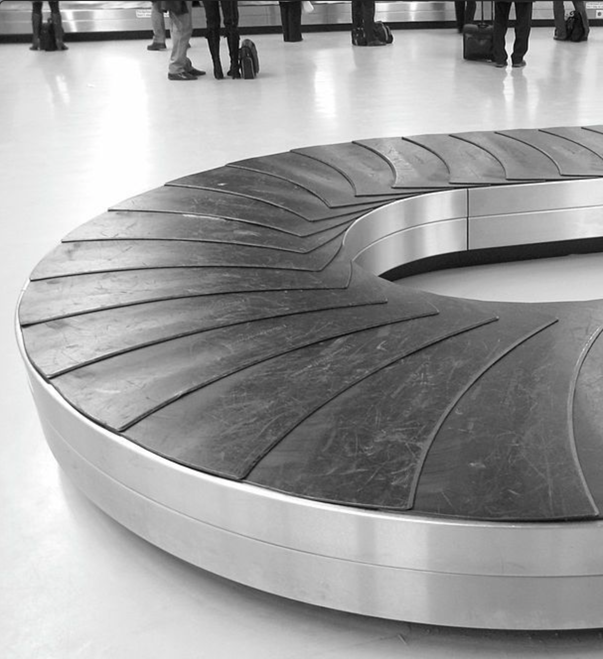
For the Check-in Display stand, we played around with surface finishing/materials on the display stand and designed it as a baggage claim.
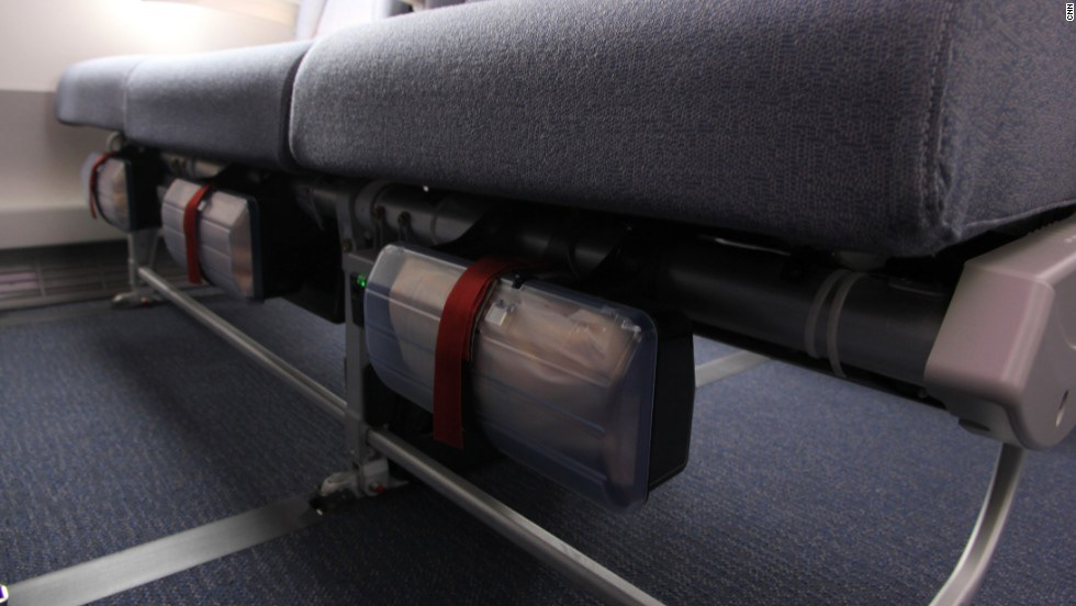
For the Carry-on area,
we simulate the layout of an aircraft seat:
1. Overhead Storage
2. Cabin Carpet
3. Space for personal items underneath the seat
we simulate the layout of an aircraft seat:
1. Overhead Storage
2. Cabin Carpet
3. Space for personal items underneath the seat
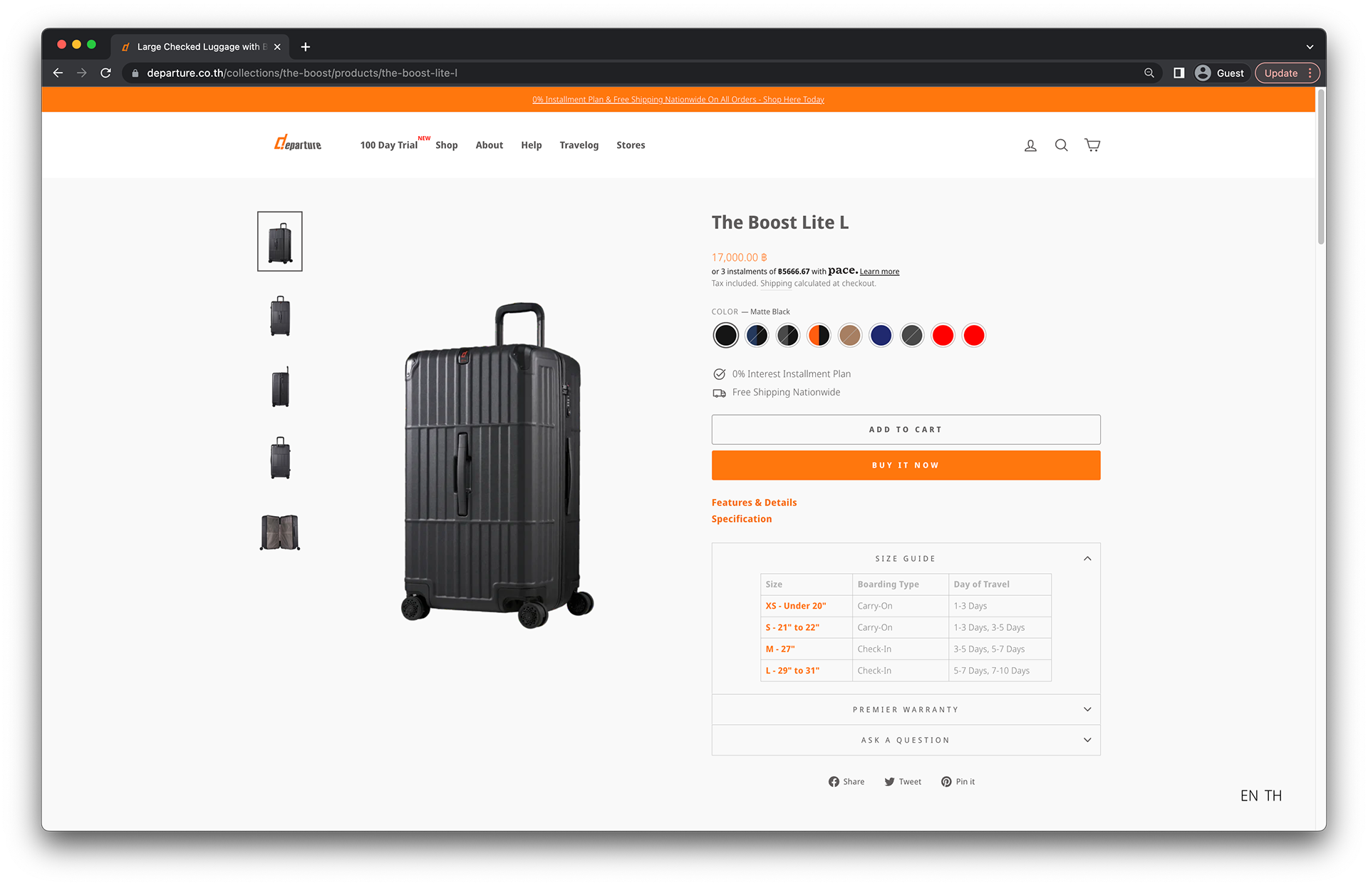
Size Guide on the E-commerce Website
——————————————————————————
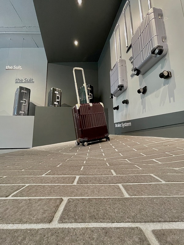
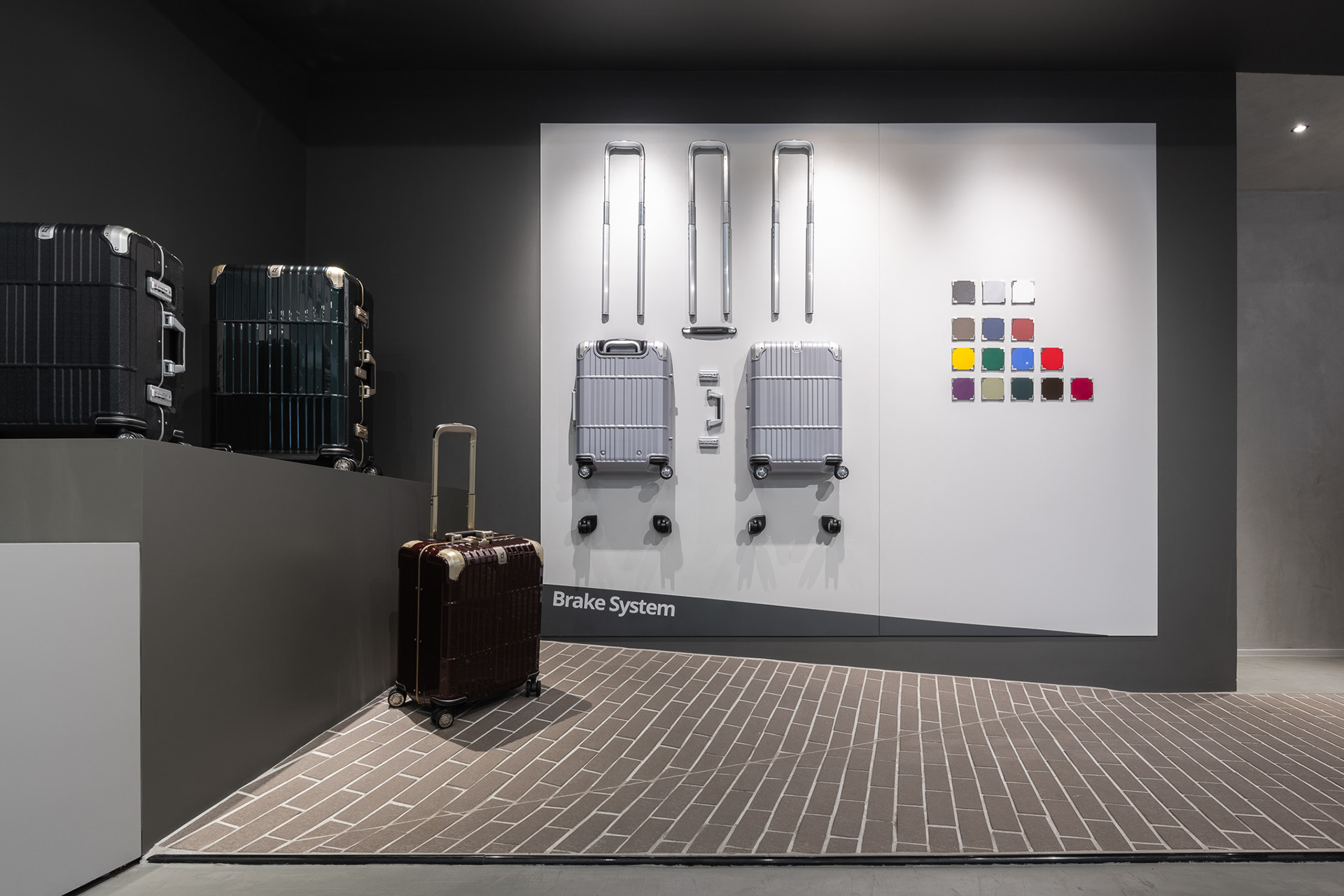
Exquisite Pavement & Dedicated Slope
Departure is super confident of the build quality, the wheels/rolling experience especially. The whole concept of the Departure Thong Lor is EXPERIENCE, it's not just the look & feels that customers perceive visually, but the tactile/ hands-on experience is really important. It's inevitable to have a "rough" journey during traveling, and so does your Departure partner. Departure Thong Lor provides two types of flooring, concrete, and pavement, to have customers a more "REAL" experience to simulate the feeling if they roll luggage on a road. Our wheels provide an extremely quiet, stable, and effortless steering experience on ANY surface in ANY direction.
Departure also prepares the dedicated 10° slope for customers to test out one of our key features—Brake System. The Departure Luggage with Brake System equips with an exclusive patented brake function design on the rear two wheels. The function does prevent the luggage from sliding on an uneven surface.
——————————————————————————
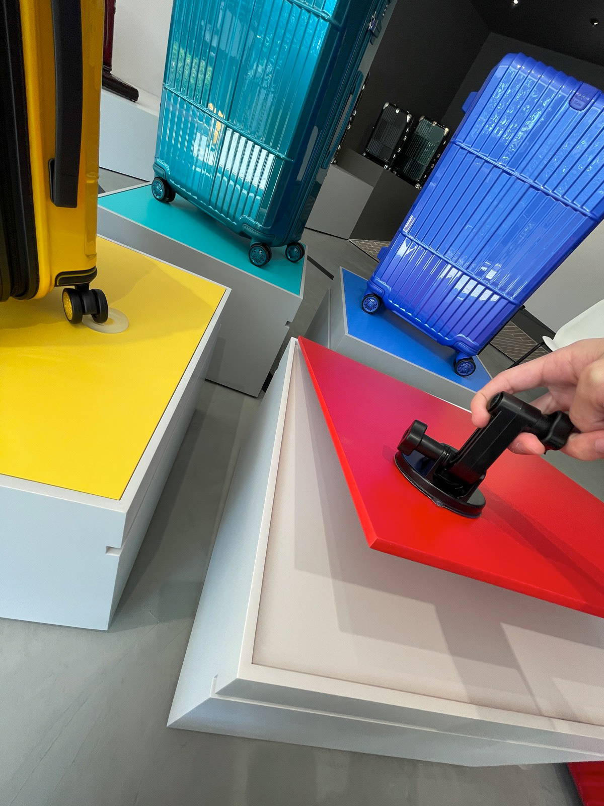
Movable & Flexible Display Boxes
In order to align with the concept of dynamic movement but keep the functionality, we came up with the design. Those display boxes can be moved around and can be seated according to our marketing strategies, or the activities/events to adjust the display layout.
Not only the display boxes are movable, but the color panel on the top of the box is detachable which can be changed to a different color to make the display box suit any product we'd like to promote.
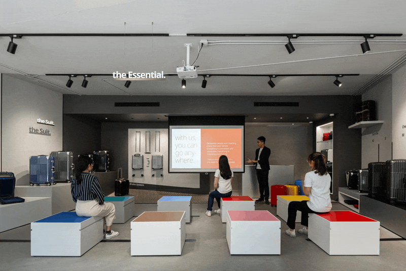
Lecture / Event setting, the display elements are multi-functional
Detachable Top Panel
Acknowledgment
Many thanks to Leon Wu, Managing Director at Departure Thailand, for giving me the opportunity to lead the project. Truly grateful for the trust he has placed in me.